Monday 30 June 2014

Summer Drawing Project–lesson 9

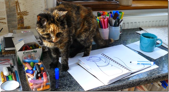
Welcome to the ‘wobbly blue jug’ drawing session! Last week you explored the ‘correct’ way of drawing a cylindrical shape; now you will progress onto ways of drawing an item such as a jug in a more ‘characterful’ way. You will of course, benefit from your knowledge of what is ‘correct’ in this more subjective, fun style of drawing. Ashy, my aged studio assistant, decides that I should really be drawing her instead, by standing in front of my jug.

P1080281

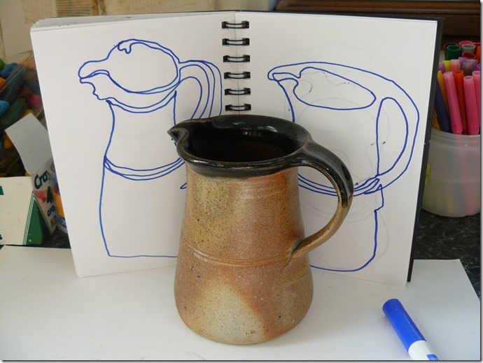
Choose an object such as a jug. It might be any colour and might even have an interesting design on it. A jug has great character (hence the Toby Jug) so enjoy drawing your own jug to show its character in your own style.

However, there are rules:-

  1. It is important to work quickly, to stop yourself thinking too much about ‘how it should look’. Just let your eyes follow any lines they can see.  Make quick drawings of just around 30 seconds. Use a timer or perhaps as long as you can hold your breath? Make lots of drawings from different angles to help you get to know your jug. You might draw just one jug per page or more than one. Just like last week, you can overlap different drawings on the same page.
  2. Move that pen or pencil across the page while looking at your jug and not looking too much at your page. Are you able to make yourself do this I wonder?
  3. Where possible, keep your marker on the page and make a continuous line.

P1080288

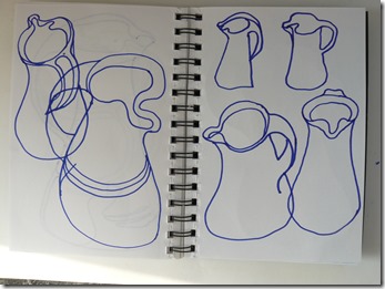
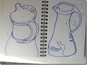
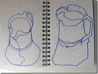
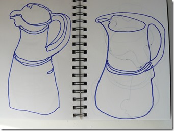
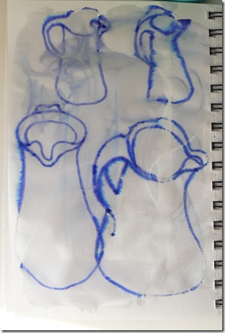
No matter how many times you draw something, it always look different.  Try looking at your jug at different angles. Will you include lines around shiny areas? Will you include lines around decorative features. The drawings below were all done with a felt tip marker which seeped through my thin sketchbook pages, suggesting other faded jug shapes from the reverse side of the pages. Remember to try drawing with a continuous line. Try curved lines, try angular lines

P1080284P1080285P1080286P1080287

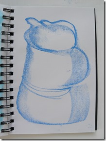
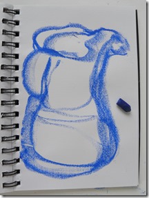
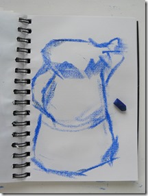
Next, chose a crayon that you can use on its side and do more drawings. Vary the pressure on the crayon; vary the type of line – smooth, flowing lines or maybe short, jagged sort of rhythms. I used a broken crayon as this length seemed about right for the A5 size of my sketchbook pages.

P1080298P1080299P1080300

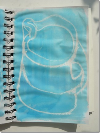
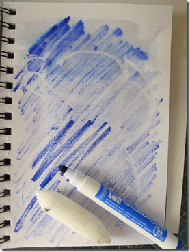
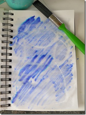
Next use a drawing method that will really force you to not look at what you are drawing. This is the equivalent to drawing wearing a blind-fold.  I can’t show you an example as it’s invisible!  I used a plain candle and a white oil pastel, but I can show you the result after I’ve painted a colour wash over the page! The watery colour wash has resisted the marks of the oil pastel. This is called a ‘resist’ method of drawing. You can do this with any marker such as an oil, wax crayon or a plain candle that will resist a water based paint/ink. The colour wash can be paint or ink, although the paint should be a water-based paint and not acrylic.

P1080294 

Beware  - note what is on the reverse of your page. The colour wash from the page above seeped through to the reverse page – below - and effected the felt marker drawings which were water-soluble! I didn’t mind this although it might not always look good when this happens – a bit of serendipity!

 P1080290  

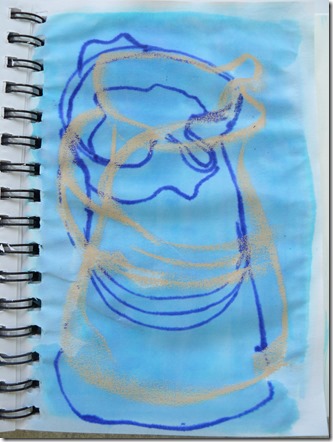
Try this intentionally and make a drawing with a ‘resist’ marker on top of one that isn’t. The drawing below was made with a light grey oil pastel (non-soluble) and a felt marker (soluble). Add the colour wash to the drawing and see what happens. It’s an idea to put a layer of paper underneath if you wish to stop the wet going through several pages. 

P1080306 

A variation on the resist idea is to draw your jug with a water resist marker, scribble over it with a water-soluble one – image below drawn using a plain wax candle and scribbled over with a felt marker.  Then painted over with plain water.

P1080292P1080293


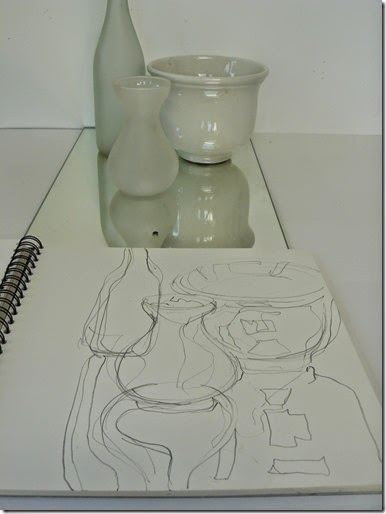
Extra challenges – place a small group of objects together and draw them as a ‘still-life’ group.  If you wish an extra challenge, place these objects on a mirror. Draw this still life with a fast, continuous line, looking mainly at the objects and not your sketchbook page. Don’t worry about ‘wrong’ lines – there’s no such thing. Just keep going and remember to work quickly.

Reflections1

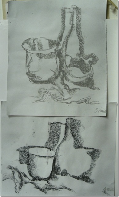
The drawings below were drawn with the side of a crayon and limited to just a few minutes each to force a speedy drawing.

still life5

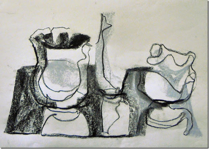
Make a fast, timed drawing with your non-drawing hand - left hand in my case!

left hand

Keep going – your drawings will get better and better. Believe me.

Next weeks lesson will be posted on Monday 7th July from Farncombe, as I and many Distant Stitch students will be enjoying the fun of our annual Summer School. Get your scissors ready!
Sunday 22 June 2014

Summer Drawing Project–lesson 8

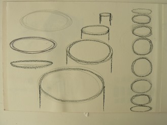
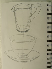
Now that you’re accomplished at drawing swirling circles and ellipses, lets move on to drawing objects that are full of circles and ellipses. You might have already noticed that elliptical shapes look like the tops of cylinder shapes. So have a look around and find some cylinder shapes to draw. If you’re reading this while drinking your morning cuppa, like me, you’ll notice that your mug or cup and saucer are made up of elliptical shapes with side walls added. Just draw vertical lines down from some of your elliptical shapes you drew previously. This row of shapes could be the tops of a row of mugs, cylindrical hat boxes, cans of paint, sawn logs maybe?

P1080272

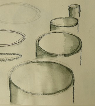
Add some shading to them like this, below, and you turn them into hollow cylinders making them look like open cans of paint or hollow tubes. Notice that the shading on the inside of the cylinder is on one side and the shading on the outside of the cylinder is on the other side (on the left)!  This is because the light direction is from the right in my drawing situation at the moment. Identify the direction of your light source and you’ll need to adjust where you put your shading.
To make the shaded areas you can use scribbled lines to gently fade away from the drawn line. Or  you can use water to drag the colour from the drawn line if a soluble medium was used. Here I use my new Intens blocks to re-define the original drawn lines and then a paint brush dipped in clean water to drag the media away from the line to make the fading shaded areas.

  P1080273 


Looking around, I then spotted my rack of cotton reels and drew a row of them. You’ll notice that the pattern of the threads were really only ‘partial’ ellipses and the sketchbook was turned up-side-down to get the swing of my mark a nice curve. (It’s so difficult drawing an arc or curved shape using your arm ‘the wrong way round’.

  P1080271

Looking around for other cylindrical forms, I found a vase, a jug and a cup and saucer to challenge myself with. Gather a few cylindrical objects yourself.

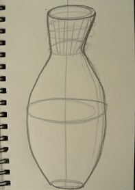
Draw a vertical line as a feint guideline down the centre of the page is helpful to get the item looking reasonably symmetrical although this isn’t essential as you’ll discover next week! But for this week’s lesson, it’s simple observation. So draw the vertical guideline and then place your ellipses so they straddle that line. You’ll notice that mine don’t always! Your cylindrical object will have an elliptical shape at the top as well as the bottom even though you might not be able to see the complete ellipse if your object is a solid one. For the moment, pretend that it is made out of glass, like the vase, and draw the whole ellipse. For this cylinder, another ellipse is drawn to make the level of the water in the vase and some cut-glass rings around the neck.

If your cylinder is a solid one, draw all the complete ellipses lightly and then go over only the edges that you can actually see to make it look as if it is solid. I don’t advise you to rub out the guideline or the unwanted ellipse lines as they (and any ‘mistakes’) all add up to a rich and interesting drawing. Seeing evidence of the ‘hand of the maker’ on any hand made object or drawing is considered a valuable and treasured ‘extra’ so don’t ‘tidy it up’ as it will look as if it has been done by a computer!

Your vertical guideline will also be useful when you come to draw the side walls of your object – if you keep them reasonably the same distance apart on either side of the guideline, the object will look reasonable up-right.

P1080276P1080275


Your cylinder might be on a table in front of you (as the cup and saucer) or it might be on the floor (like a waste-paper bin or basket), or it might be on a shelf such as a vase or tin of paint. So, a different height will require a different type of ellipses.

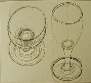
The drawings of the wine glass below shows the left one as if it is placed on a very low level table, the middle one is on a table and the right hand one is perhaps being lifted close to your lips.  Notice how the ellipse is very wide and open when the glass is positioned quite low to your eye level and gets more compressed as it gets closer to your eye level. Try placing your cylinder at different heights and notice how the ellipses change at the different heights.

    P1080268P1080267

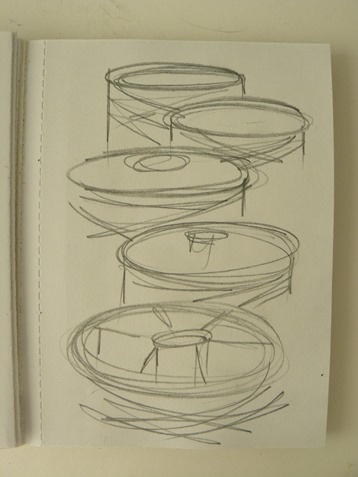
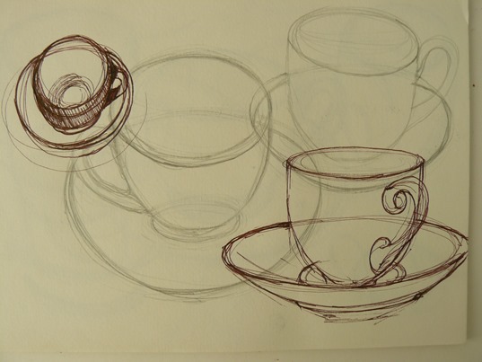
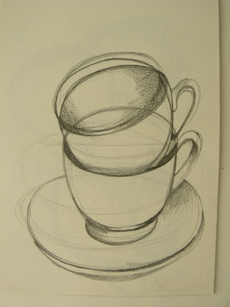
It’s fun to try drawing the same cylindrical object from different angles and overlapping them as below. Use different drawing media – pencils, crayons, biros, felt pens. You decide whether to add shading or to keep them linear drawings.

P1080270 

Perhaps you’d like to arrange a small group of some cylindrical shapes into a still life.

P1080266

Next lesson 9 will be posted on Monday 30th June.

Sunday 15 June 2014

Summer Drawing Project – lesson 7

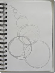
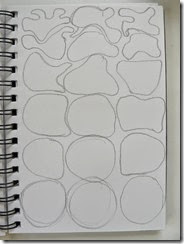
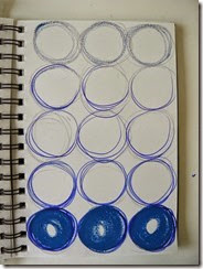
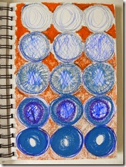
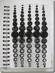
This week’s challenge is to make the paper surface appear to be curved. This will be an optical illusion of course but you can do this by covering your page with rings, each one changing in some way to suggest that the surface isn’t flat.

Discover ways of modifying your rings by gradually changing the way you draw it –

  • changing its size
  • changing its colour
  • changing its tone, change its shape
  • changing its texture
  • perhaps combining more than one of these

1234

Covering the surface with different sizes and different types of rings made interesting pattern effects but they didn’t seem to make the page look as if it was curved.

I decided that I needed to organise the gradation of sizes and shapes in these ideas so that they gradually change from one to another. See if you agree.

51115

I found it easier to draw the rings shapes lightly in pencil first to help me get it right in coloured media. I covered the page with just one graded idea before deciding which colouring method to use. Notice that each ellipse and ring were sometimes drawn several times over each other until I felt the ring was right. No need to rub out – just work on top a bit darker over it when you think it looks better. You’ll notice a lot of rings underneath other rings in these pages –  this is just me trying to get into the right ‘swing’.

679

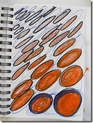
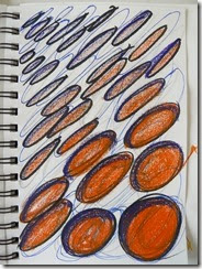
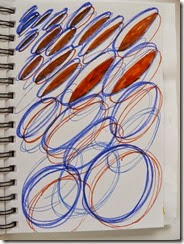
Making the rings appear to get flatter and flatter towards the top of the page and becoming more elliptical so seeming to disappear over the curved surface. Also by grading the intensity of colour.

8 8 10

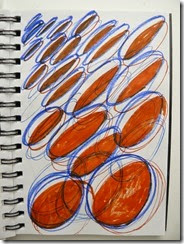
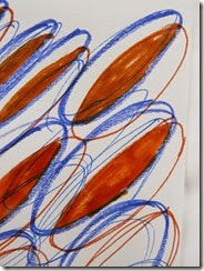
Drawing the elliptical rings in the same way and because there seemed to be so many ‘trial’ rings on this page, I decided to draw pairs of over-lapping rings – a blue one and an orange one.  I then ‘coloured in’ by adding solid colour to the shape created by the overlap; see the right hand image close-up above.

12 14 

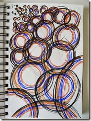
This page is drawn with several rings where the sizes are graded from large to small (at the top). Several colours were used inside each ring to emphasise them. Notice the brave addition of ‘arc’ shapes towards the bottom to suggest rings that were too large to be added to the page. Best to draw these by turning the sketchbook around so you make good use of the natural radius arc that your arm can do to make a smooth and confident curved arc.

202122

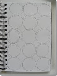
A pattern of rings of the same size, same colour but different textural scribbles and tonal changes from top to bottom.

23 24

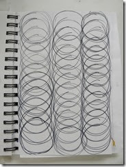
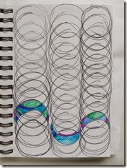
Columns of over-lapping rings (draw vertical lines first to keep your rings in columns). Then look what happened when I stared to add colour. Must add more colour to make more of these lovely undulations. I’m sure there are more variations to be found.

22

Playing with a different composition of different sized rings I worked in black but added a change of texture by filling in the rings in different media. I couldn’t believe how this page seemed to curve!

161718

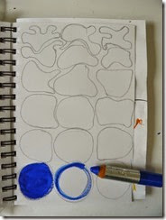
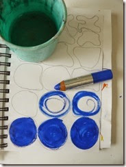
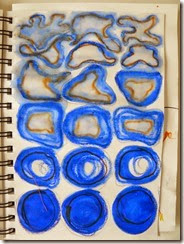
A fun one to do – trying to make the perfect rings at the bottom look as if they are melting away towards the top of the page. I changed the shape gradually and made the colouring more and more watery. I sometimes dipped my water-soluble pencil into water to draw with; I sometimes wet the ring with clean water and then crayoned into it using different degrees of pressure.

27

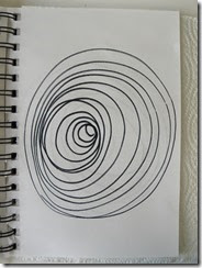
The last mage shows an interesting drawing using rings of graded sizes. I found it in a book (‘Principles of Form and Design’ by Wucius Wong) and decided to try to copy it.

It looked like a 3D form – perhaps a cone with an inverted crater? I was fascinated to try to work out how to draw it. All the rings are separate – not spirals and you start with a small ring in the middle of a large ring and then add all the other rings. Anyone like to try it? And if you do, try it with colour?