Sunday 31 August 2014

Summer Drawing Project – Lesson 17

Ways to figure this out!

It’s a huge challenge to draw figures so I’ve devised a simple way to get you started. It’s called ‘deluxe tracing’. But forget the tedious maps you used to trace in geography and have fun with ‘scribbled’ tracing – the deluxe way to help you make a start on drawing complicated subjects such as faces and figures.

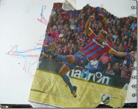
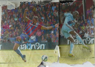
First of all, find photographs of figures that are slightly smaller than your sketchbook page. You might find these in a newspaper, magazine, or print them out yourself from your computer. I started by using sports figures that were open silhouettes, with arms and legs showing and not ‘bundled together’.

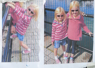
Then I printed out some family pics of two little great-nieces (or grieces as we call them). The thin ‘everyday’ printer paper is ideal for this method so don’t use glossy, expensive paper. These poses showed plenty of space around the limbs which made drawing them much easier and gave more exciting results – with drawings full of action.

P1080801 P1080801

You are going to turn the backs of these images into transferrable surfaces, so a little experimentation is needed first to find out the best medium to use. Scribble solid blocks of different types of dry media onto a scrap piece of paper.

P1080781 

Above from the left are blocks of black pastel/chalk, oil pastel, graphite stick and a soft water-soluble pencil on the right. All worked well. A biro was used to scribble on the reverse side to transfer the scribble lines onto a plain paper below. You can see the indents made by my scribbled biro lines in the paper above and the transferred scribbled lines in the lower line of ‘trials’.

P1080782

A biro was used to scribble on the reverse side to transfer the scribble lines onto a plain paper below. You can see the indents made by my scribbled biro lines in the paper above and the transferred scribbled lines in the lower line of ‘trials’.

P1080781

I decided to use oil pastels for all my transferred drawings this week and a found a well-sharpened hard pencil to do the drawing.

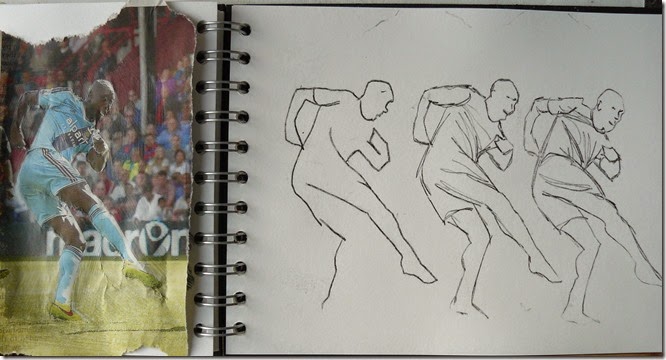
Place your photograph onto your sketchbook page and hold it with small bits of sticky tape ( masking tape) I also found it useful to drawing little alignment markers on the page just incase you needed to re-locate the photo on top of your image. If you’re anything like me, you’ll want to peep to see how it looks and then can’t re-locate it in the right place!

P1080785

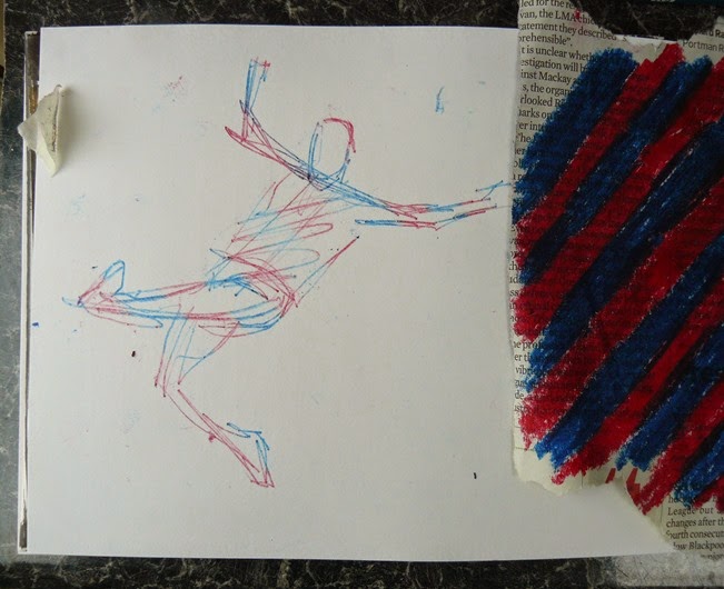
The three drawings above of the football player were done by moving the photo along the sketchbook page and making another drawing. If your lines start to become feint, you can always apply more crayon on the reverse of the photo.Try different lines to make your drawing -

Try a minimal drawing, around the outline

Try drawing internal lines, particularly to suggest the way the figure is moving and stretching.

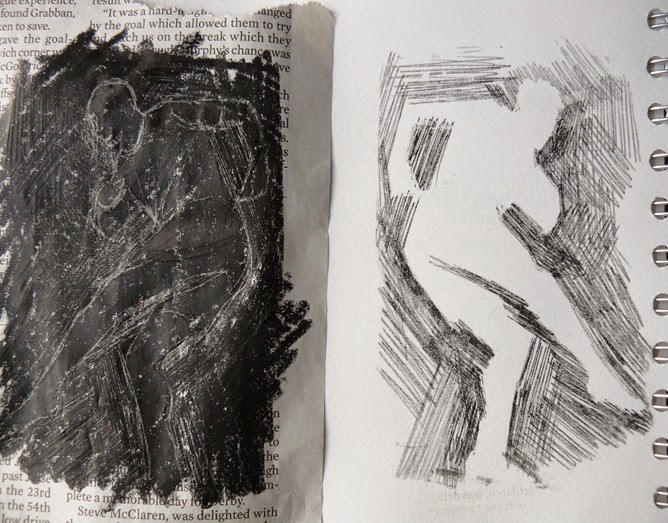
Try drawing only external lines and maybe acknowledging a background pattern or emphasising the feeling of movement. The different areas of lines below follow the direction of the edge of the body. You can see the indented lines showing on the reverse of the photo in the left image below. These were made as a result of all the transferred drawings of this figure above and below.

P1080786

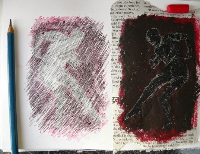
Instead of adding more black to the reverse of the photo to carry on doing more transferred images, I added red oil pastel to only the negatives areas around the figure – see below right. I then did another transfer drawing – this time by scribbling all over the entire reverse surface and produced the image below left.

P1080788

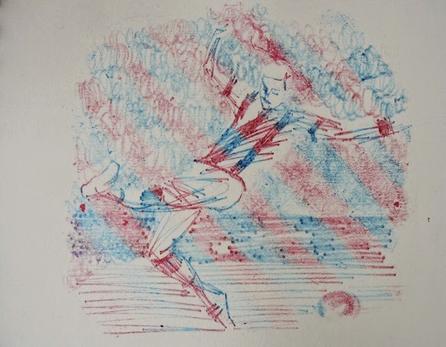
You can have fun with making different colourful arrangements on the reverse of your photo. I chose a different footballer and put coloured stripes on the reverse to acknowledge his team stripes. It’s fun to see that the different colours appear unexpectedly. A more lively, relaxed scribbled style of drawing in this one too.

P1080795 

You can also experiment with different ‘points’ to transfer the media. The figure below was drawn with the point of a hard pencil as before and the background areas were made with the opposite end of the pencil and a rounded shape. These made soft transferred effects which might be useful to contrast with sharper, harder lines.

P1080798

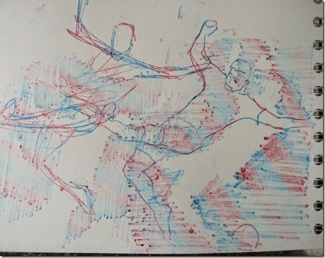
You can make a composition by overlapping your figures or even combining more than one on a page. You can tilt your photo and use just part of it if you wish. Try using different methods of drawing together in your composition. The page below is composed of the same figure and colours but some drawings are linear and some have scribbled negative spaces. It was fun to try to make a drawing appear to be of several figures and was full of movement that complemented the movement in the initial figure.

P1080796

P1080797

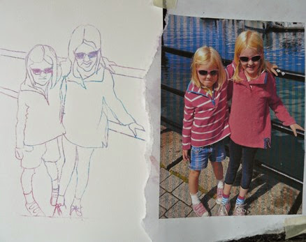
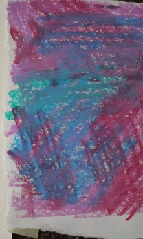
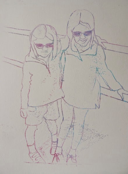
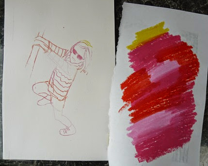
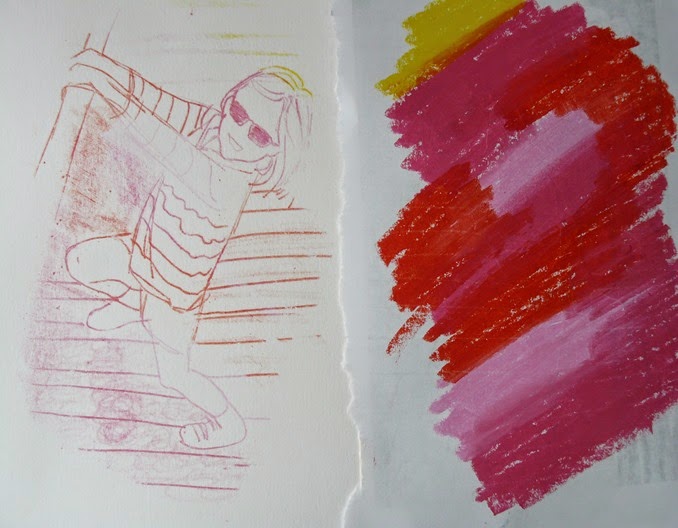
Now try with some of your own photos. Print them out onto cheap, printer paper and make sure they are the right size for your sketchbook page. I coloured the reverse of this photo of Amelie and Beatrice with pinks as, being 4 and 7, they are a very ‘pink’ pair of little girls.

P1080800 P1080799

Try adding little dots to suggest shadows.

P1080802

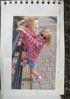
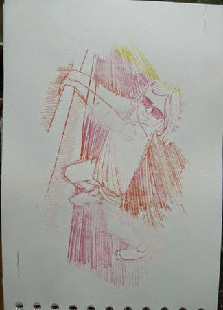
I then chose a more active image of Bea, firstly drawing just the outlines and some of the simpler internal lines lines. Again, I used reds and pinks with a touch of yellow for her blond hair.

P1080790P1080791

I then replaced the photo and added in more lines – this time to suggest the ground.

P1080793

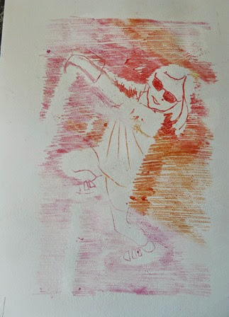
Two further ways of adding interest to the negative spaces around the figure. My favourite is the right one below as this suggests lots of movement which suits Bea as she never stops!

P1080815 P1080818

You can do quite a few transfer drawings without having to replenish the colour on the reverse. Whatever colour you add on the top layer will be the dominant one to transfer. A blue oil pastel was added to the ‘pink’ surface below.

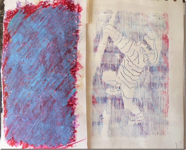
Why not try adding some low relief to your page surface before you transfer your drawing? The right hand page below was painted with bands of gesso and the drawing was made when this was completely dried.

P1080816

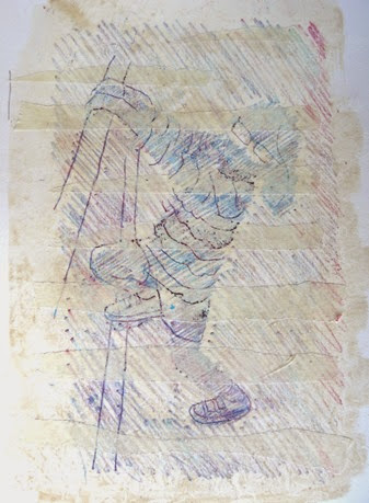
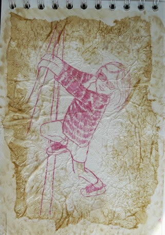
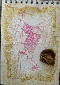
Ripped strips of masking tape were added to this page before the transfer drawing. It isn’t very successful as the colour doesn’t seem to show up very well on the tape. I then tried some crumpled tissue paper and this worked better. Try some ideas yourself – perhaps looking back to the previous lessons for ideas.

P1080817P1080814

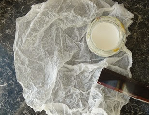
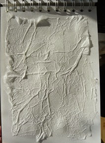
Stages of making the crumpled tissue surface -

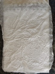
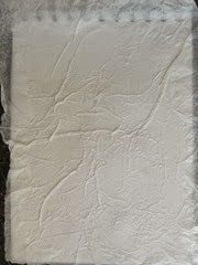
Crumple a piece of white tissue paper and paint your page (not the tissue) with PVA glue.

Press tissue gently onto the glue surface but arrange with just fine creases.

Press harder so the tissue is adhered to the page surface, showing fine lines of the crease without any air pockets.

P1080806 P1080807 P1080808

Rip excess tissue away and make sure edges are fully attached.

Make your drawing when the glue has dried.

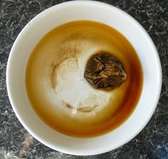
You might like to try adding a touch of ‘sepia’ to the edges of your tissue. A tea bag does this well. Pour hot water onto a teabag and when it cools, use it to dab a tint of sepia to make a gentle border.

P1080809 P1080813 P1080810

Next weeks lesson will be posted on Monday 7th September. Look forward to seeing you there!


Monday 25 August 2014

Summer Drawing Project – Lesson 16

Finding your own rhythm

Take a look around you and notice where you might find rhythmical lines for inspiration, similar to those you’ve been drawing in the previous lessons. I’ve noticed some wonderful rhythmical ripples in the sea and sand in my recent seaside holiday. I also saw swathes of ripe corn in the fields that the train passed alongside. Back home, I noticed groups of stems and grasses in the over-grown garden.

Use whatever ways you like of making your rhythmical marks. Drawing media such as pen, pencil, crayon or inks could be used to make your marks directly onto the page. Or you might like to work with the layered media of ‘sgrafitto’ (scratching back).

If you’re working from a photograph, you already have your frame although you might like to crop it down to improve it so it focuses on the rhythmical lines.

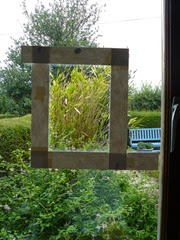
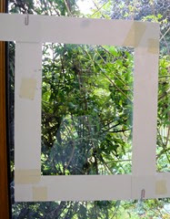
If you’re looking through a window, you might like to frame the area of rhythmical lines you are drawing to help you focus on them – stick some paper strips onto the window to make it easier to focus on your rhythm. I’ve stuck two paper ‘L’ shapes to focus on the strong vertical lines of the clump of bamboo on the left and the tangle of fines lines of the clematis on the right.

Agarden4  agarden5

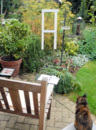
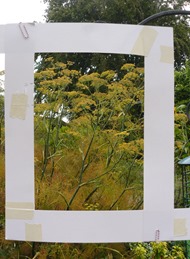
If you’re sitting outdoors, settle yourself into a comfortable position with your drawing media around you. You might even be able to prop up a make-shift window frame to help you focus on your linear rhythms. I’ve clipped two card ‘L’ shapes onto the bird feeder here to make a window to help me focus on the huge clump of long fennel stems and seed heads beyond.

Agarden1 Agarden3

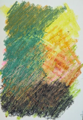
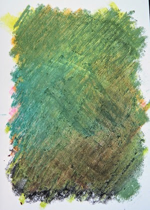
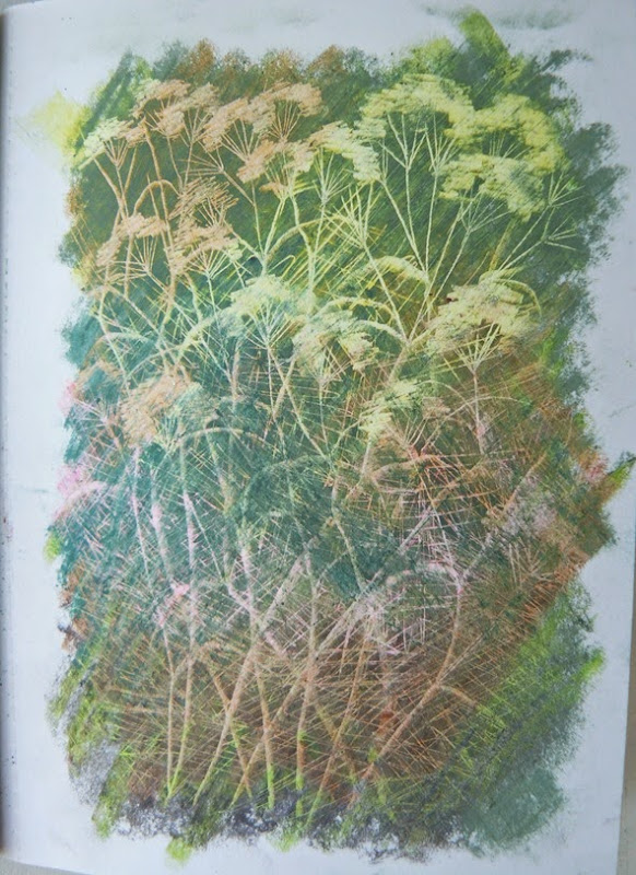
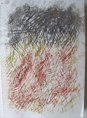
Just to remind you, you need to build up two layers of media for the sgrafitto method. The left hand image shows the lower layer of wax crayons and the right hand one, the top layer of chalks. The colour of the lower layer will give you the colour of the scratched lines and the top colour will be the background colour as you can see on the finished drawing below these.

b4   b4

 P1080728 

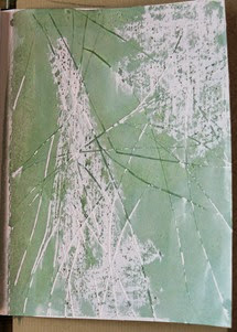
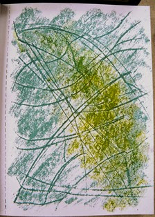
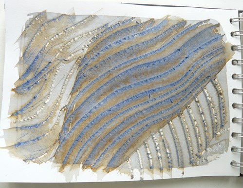
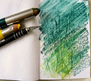
Scratching the paper surface makes lots of grooves or indentations, depending on what sharp instrument you use. The scratches or striations on the page below was made with the point of a craft knife to suggest the waving rhythmical directions of long grass as it has been swept (or ‘lodged’) by the wind. Soft coloured chalks were rubbed lightly across the surface, sometimes with a finger, to attach colour to the paper burrs.

Ascratch5      P1080724 

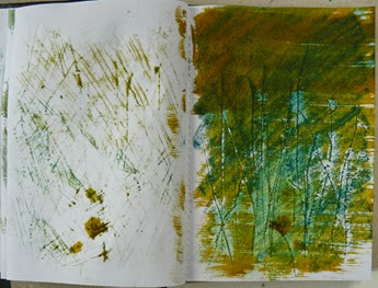
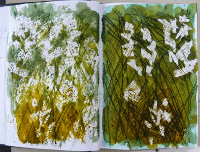
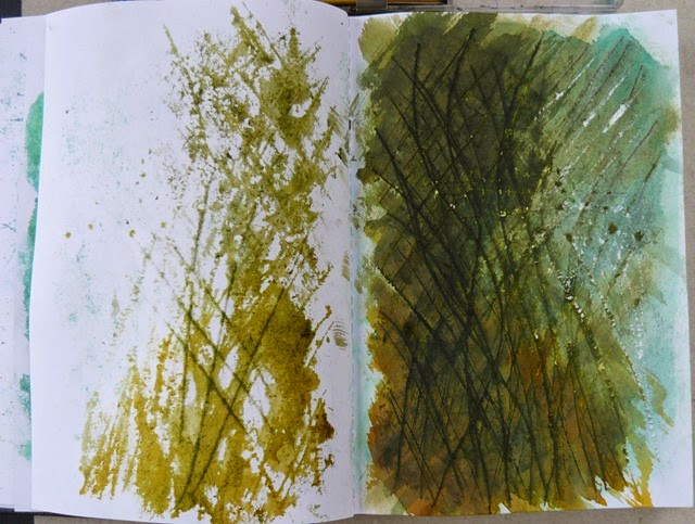
Liquid colour can also be used this way, as you’ll have already discovered. The striations on the page below were made with the craft knife blade and coloured over with water-soluble pencils or sticks and dampened with a wet paint brush. Notice the bonus of the print on the opposite page made when the the book was closed too soon – or maybe not?

ascratch6  scratchpaint1

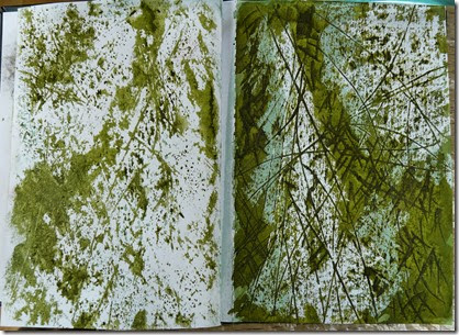
The tangled mass of lines of the clematis (finished drawing on the right below) was made with a point into the paper surface which had previously been coated with a wax candle. As you’ll appreciate, the colourless wax will keep these areas white, unless scratches are made into the surface, when liquid colour is applied on top. The first stage of adding coloured inks (below left) allowed the sgrafitto lines to show up. More lines and more ink was added to suggest layers of the tangled lines. Notice the exciting ‘print’ made deliberately on the opposite page? This now almost becomes a part of the finished drawing.

c1  c2

More drawings below of grasses and stems using vigorous sgrafitto lines.

Ascratch4  scratchpaint2

The secret of being able to capture the movement and rhythm is to work quickly and don’t add too much detail. Not everything will work out, but keep going. Look out for ‘happy accidents’ like the print on the opposite page and try to do it again in your next drawing.

scratchpaint3

Lesson 17 will be published on Monday 1st September, with four more lessons to go. The next series will be a completely different topic as we look at faces and figures. I’m going to start to go ‘digital’!

Sunday 17 August 2014

Summer Drawing Project – Lesson 15

Meandering curves to make your pages roll.

Take your rhythmical lines a stage further and make them create a curvaceous surface on your pages.

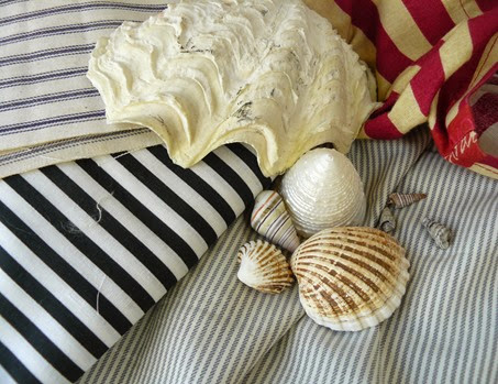
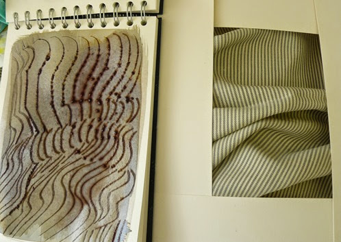
Look at curved surfaces to study that are linear. I found some shells, a fabric shopping bag and some fabric that I could ‘scrumple’ up.

P1080769

Perhaps you have plump stripy cushion or a striped tea towel or a piece of striped fabric you can make undulate to create a rolling surface.

Perhaps you can see rolling hills with lines of crops or trees.

Perhaps you have a shell that has a linear pattern.

Perhaps you have a stripy fruit or leaf.

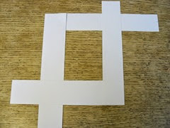
Make yourself 2 ‘L’ shapes from strips of white card or paper. These two ‘L’ shapes can be moved to over lap more or opened out to make different sized rectangles or square ‘windows’.

P1080758

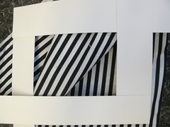
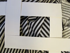
Make your ‘L’ shapes resemble the same proportion as your sketchbook page and place them over your surface if it is a large one to select an interesting (but not too complex) composition. I used this to select an area of my fabric but no need for the shells as they had their own shape. If you’re looking out of a window at stripes outside, you could tape your ‘L’ shapes to the glass to give you a selected view of your stripes. 

Try different areas until you find one that shows a simple composition: the one below left is a simple one and the one on the right is quite complex. Start with a simple one!
P1080759   P1080761

Use any way of drawing your lines – it could be a crayon used on it’s side, a wide paint brush, a strip of card, a fine pen, depending on the sort of stripe you are drawing. You could also use the sgrafitto method of ‘scratching back to a different layer or scratching into the paper surface as in last weeks lesson.

  P1080768

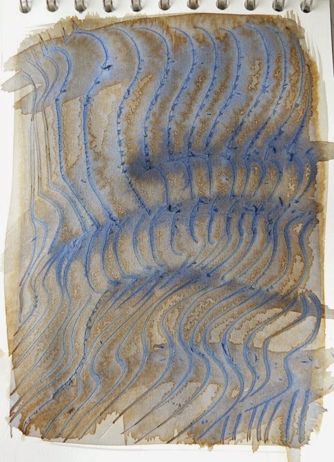
The drawings above and below have been made by drawing the wavy lines to echo the observed undulating fabric stripes with the point of the seam ripper into the wet surface of the paper. Just copy the stripes and this creates the undulating fabric surface for you.

   P1080765

A second stage of this drawing you can see in the image below adds slight shading to suggest the darker dips in the undulating fabric surface. This was done by adding a ‘dash’ of extra ink while the surface was still wet so that it would blend gently into the first stage.

  P1080767

The drawings below have been made from a very simple striped fabric composition – just one curved fold. Both drawings were made with a strip of card, dipped into the ink – the left hand one into a watery ink and the right one straight into the ink pot. Notice that the dip between the fold has been dabbed with ink to suggest the shaded ‘valley’. The left hand shading has been done with a light touch with the sponge and the right one with the card dipped into the watery ink. This shading helps to suggest the depth of the undulating fabric folds.

It’s a good idea to draw the same composition more than once, maybe using different media or even the same media as you learn a lot about the surface by looking more deeply and trying it again and again.You’ll get a lot better!
distortion7

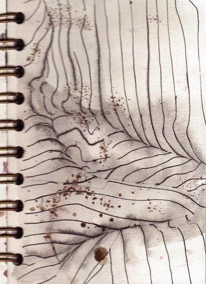
If you’d like more of a challenge, arrange some stripy fabric to make a more complex composition of stripes. The stripes below have been carefully drawn with a fine pen to record a more exact copy of the different directions that suggest the more complex arrangement of crumples. The ink in this pen is not permanent and it’s possible to smudge it with a damp brush or sponge or even your finger. This is how the darker areas were created to suggest the valleys. If you can find a drawing pen like this, you’ll enjoy using it this way. (The speckled marks are from the drawing on the reverse side of this page. Although this looks quite good in this drawing, you might like to consider drawing only on one side of a page if you’d prefer.)

distortion6

The same undulating fabric has been drawn using a cotton ear bud or cocktail stick for finer lines dipped into bleach into a pre-coloured page. This will need to have been a colouring media which will react to bleach such as writing ink and brusho. (HINT – Work in a well-ventilated space; don’t use a paint brush as the bristle will be effected by the bleach and – do a test first).

Be patient, as the bleach doesn’t give a white line immediately. It’s a skill to get the right amount of bleach onto your cotton bud – by keep dipping into the bleach and not expecting it to ‘stretch’ as you do with inks and paints.

distortion6

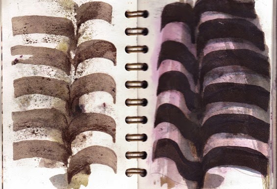
Now for some shell surfaces – both drawn with a  wide paint brush that is very old and bristly. The brush has been dipped into the ink pot in the left hand drawing and into the watery ink in the right hand one.

distortion4 distortion5

Remember, in all your drawing – just draw the stripes.

Next week’s lesson finishes this section of linear rhythms. It will be published on Monday 25th August.